If anyone went through a DeviantART phase, there was a chance that they saw an occasional preview leading off site to a web comic series. This popular series, made by one Katie Shanahan, is chock full of humor, great writing and well drawn visuals and many more to draw its' readers in. And as a result, it became quite a popular series. Now let’s get down to business
General Information:
- Title: Shrub Monkeys
- Author: Katie “ktyshy” Shanahan
- Comic Format: Digital, Vertically Aligned, Multi-Panel
- First Published: September 4th, 2006
- Update frequency: Last post April 5th, 2012, presumably discontinued
- Genre: Comedy, Slice-of-Life
- Anne of Green Gables
- Harry Potter
- Conventions
- Scooby Doo
- Canadian weather
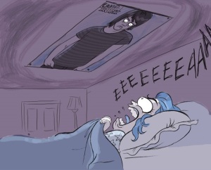
From a visual standpoint, Shrub Monkeys are very appealing. Katie Shanahan possesses a good grasp of anatomy and architecture, an this occasionally shows through in her comics. She also knows how to successfully portray emotions in an exaggerated and comedic manner. As a result, she is able to create comics that utilizes all the space given and and shows a strong talent for illustration an story boarding. For example, let’s discuss this one panel from one of her comics;

Let’s begin with the author’s avatar, in this case being herself. Her eyes are cartoonishly large with small pupils, giving the impression of being wide eyed with horror. The furrowed eyebrows further illustrate the emotions of sudden fear and surprise. Secondly, her mouth is not just open, it is practically unhinged. The showing of teeth, the protruding tongue, even the droplets of spit flying outwards make it seem more like she’s frightened. The written scream let’s the reader know that she is not simply silently horrified at the image above her, but startled by it enough to warrant a frightened scream.
As for the poster, by taking the image of the poster and exaggerating one of it’s features, in this case being the eyes, the artist is able to take an otherwise harmless object such as a poster and give it a slightly fearful appearance. After all, who wouldn’t react the way the author did if they saw a face like that hovering over them?
Another thing done very well in Shrub Monkeys is the the way the comics are written. The author knows how to make the jokes in her comics stretch out and compose them in a way that the buildup for the end makes it all the more funny. To further explain my point, here is another segment from one of her comics;

The author could have simply stopped at the first two panels and the comic would have ended on a comedic, to-the-point joke. But by adding the extra panels and including the changes in Katie’s character’s facial expressions, she is able to draw out the joke and make it seem funnier because it leaves more of an impression on the reader.
Why I Don’t Like It:
To be honest, there is hardly anything I can find wrong with this web comic series. From both an artistic and story telling perspective the author excels in both. If there were anything I were to have any qualms about it, however, I would probably have to say it’s the monochromatic coloring style. Colors can be used to imply or even intensify the emotions the author wishes to convey in a comic strip. By consistently using different shades of cool colors, like that which can be seen above, which usually symbolize relaxation and contentment, I feel that she is missing out on a chance to add a little emphasis to whatever emotion or humor she’s trying to convey. Aside from that, there are no beefs for me to have about this web comic series.
In Conclusion:
Shrub Monkeys is a shining example of how to do a successful humorous web comic series. It’s art style is fluid and stylized enough to allow ridiculous expressions for comedic effect. The writing and panel layout allows for the joke to last longer and therefore seem funnier to the reader. The references to nerd culture and Canadian life not only give something for the reader to sympathize with but also learn about another country’s lifestyle through a visual story-telling format. Sure, the consistent monochromatic color scheme of shades of blue can take away from possible funnier reactions, but it’s not enough to make the comic lose any of the comedic magic already spewing from its’ every metaphorical orifice. All in all, it’s of my opinion that Shrub Monkeys is one of the better web comics to be found among the internet.
Rating: 4.75/5
Shrub Monkeys © Katie “ktshy” Shanahan
Katie Shanahan’s website
Katie Shanahan’s DeviantART
Katie Shanahan’s Tumblr
Katie Shanahan’s Twitter

Not sure having a 'Why I don't like it' section is necessary for a review about a comic which you do, in fact, appear to like. (unless I'm missing something?)
ReplyDelete....That sounded a lot more brusque than I intended, sorry. The review was an enjoyable read! Gonna check out the comic now. :)
Delete