

URL: orcomic.smackjeeves.com
Creator/s: Mehmet Hassan
Run: 11/12-current
Schedule: Random
Website: It seems like another straight-up Smack Jeeves template, so it obviously needs some work. It at least has an About page, but it's completely unformatted, causing it to be presented as an unreadable wall of text. The creator should learn some basic HTML in order to make the page look more appealing, and the character bio also belongs here instead of in the News page. It's also awkward how the home page shows an old "first draft" of the webcomic instead of the latest page. The creator should keep in mind that the page that shows up first is what a potential reader's first impression will be of.
The creator started off by posting 15 pages in a five-day span at the end of November, but on Dec. 17, less than a month after launching it, he posted that the webcomic's already going on hiatus "for a few weeks." This is a lousy way to begin a project, and it would've made more sense to either pace the webcomic reasonably so there'd be a buffer, or to wait till after the holiday vacation to kick things off. I wouldn't blame the webcomic's readers if they get the impression that the creator doesn't seem committed.
Lastly, making a Facebook page for the webcomic's a good way to help promote it, but the creator hasn't updated the page since the day he made it. Having a Facebook page is kinda pointless if nothing happens on it.
Writing: The main goal when writing a story's to get the audience to care about what happens to the characters. The creator tries to accomplish this by introducing an edgy, badass action hero, but after 19 pages of, as one of the webcomic's fans puts it, "senseless violence," no attempt's been made yet to show the character's motivations, history, or personality. It's conveyed that the hero's goal's to kill a group of villains known as "The Gentlemen," but I don't see any reason at this point to care if the hero succeeds or not, which is a major problem for the webcomic.
The creator provides a 200-word explanation of the webcomic's setting, which is actually fairly compelling, as well as a 170-word character bio, but none of it has any relation to the content so far. There's nothing wrong with having action scenes, but the webcomic needs to balance them out with exposition. I assume that the creator intends to get to the "good stuff" eventually, but if I were a potential reader, that expectation would do little to entice me to start reading now. Offering quality content on a consistent basis is a much more effective strategy.
Lastly, the webcomic's title's as vague as possible, and it fails to offer any indication about the webcomic's content. Fantasy, adventure, and action are popular genres, and a better title would suggest that the webcomic falls in one or more of those categories.
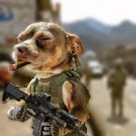
Art: The first thing readers should notice is the unusual way the webcomic's drawn, which looks a blue ballpoint pen on a weird texture. I'm guessing that a particularly experienced artist could pull this off somehow, but someone like the creator, who's just starting out, should stick to black ink on a white background like everyone else does. It's generally a bad idea for creators to rely on unorthodox techniques before they've demonstrated that they have a firm grasp of the fundamentals.
The creator explains that he intends his characters to look like "bizarre strange works of failed science," but I find the result to be unappealing. Instead, his characters look "blobby," in the sense that there isn't a strong notion of the underlying bone structure. They also look silly and oddly proportioned, which doesn't seem appropriate for a dramatic action story. In addition, the hero would probably be more interesting if he was more expressive and didn't have the same angry face in every panel.
Backgrounds obviously need a lot of work, and the creator even stated that he's looking for a co-artist who "can draw backgrounds good." I don't see this as being a realistic option, and the creator needs to display a greater sense of discipline by spending the necessary amount of time and energy drawing his pages. Not only does the lack of backgrounds make the scenes overly minimalistic, but it screws with the narrative flow as well, such as when the thugs in the bottom panel here literally come out of nowhere. The lettering also needs to improve, as there's not enough effort being made to have it mesh well with the artwork.
Lastly, the special effects are creative, but they don't work well in a sketchy, colorless webcomic like this.
Overall: O.R serves as an example of a lot of the mistakes that newbie webcartoonists make. Considering that it's a poorly drawn webcomic consisting entirely of "senseless violence," it isn't gonna appeal to many readers. However, the best way to get better at making webcomics is to make webcomics, and I hope the creator can accept that his project's primarily for practice and his personal enjoyment.
1/5

No comments :
Post a Comment